Designing for Social Good: Healthy Meal Prep Platform
Problem: Busy working professionals lack time to prepare and access to healthy foods.
Solution: Design a cross-platform product that teaches users how to prepare healthy meals using ingredients they can quickly and easily access. Chefly is a cross-platform product developed for social good. Chefly aims to teach the community how to prepare wholesome meals, snacks, and drinks so that they can stay healthy.
Chefly targets busy adults desiring but lacking access to healthy foods due to socioeconomic factors such as income.
Understanding the User
Research: Summary

I conducted interviews and created empathy maps to understand the needs, behaviors, and motivations of the users I’m designing for. I discovered that many target users believe that preparing healthy food is outside of their reach.
This group confirmed initial assumptions about potential users, but research also revealed that time was not the only factor limiting users from cooking at home.
Other user problems included cooking skill/ability, lack of ingredients on hand, or other challenges
that make it difficult to get groceries for cooking.
Pain Points
Time
Busy professionals do not have the time to prepare meals
Bias
Cooking platforms assume users have access to expensive or unique ingredients
Accessibility
Platforms for cooking food are not equipt with assistive technologies
AI
Platforms exclude important information make it difficult to make informed recipe selections
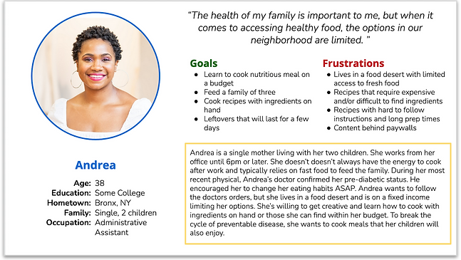
Personas


User Journey Map
Mapping user journeys revealed possible pain points, improvement opportunities, and the usefulness of features such as serving size adjustment and search by selected ingredients.


Ideation: Paper Wireframes
Taking the time to draft iterations of each screen of the app using paper wireframes ensured that the elements that made it to digital wireframes would be well-suited to address user pain points. For the home screen, I prioritized a quick and easy search feature to help users search based on on hand ingredients.


*Stars were used to mark the elements of each sketch that would be used in the initial digital wireframes
Starting the Design
Low-Fidelity Prototype
Using the completed set of digital wireframes, I created a low-fidelity prototype.
Features:
-
User flows to customize the experience, view and save recipes, and create shopping lists
-
Simple & consistent navigation to help users flow through the app seamlessly
-
Accessible transitions

** View the Chefly low-fidelity prototype V2 **
Usability Study: Findings
I I conducted one round of a usability study. My findings helped guide my designs from wireframes to a low-fidelity prototype.
1
Search
Users want an easy way to find recipes based on on-hand ingredients
2
Dietary Preferences
Users want to be able to set preferences based on dietary restrictions and allergies
3
Favorites
Users need better cues and feedback that they've added recipes to favorites
4
IA
Users need a more intuitive way to navigate the app
Refining the Design
Mockups
Early designs lacked clarity on how to search by on-hand ingredients. After usability studies, I added additional cues to indicate this action as an option.
Before Usability Study
After Usability Study

Early designs allowed users to quickly navigate the app using the hamburger menu. During the usability study, users expressed challenges navigating the UI. I added a navigation bar and revised the hamburger menu options.
Before Usability Study
After Usability Study

Key Mockups

High-Fidelity Prototype
The final high-fidelity prototype addresses the main user pain points by providing an easy to use design that is inclusive and accessible.
Features:
-
Simple & consistent UI to aid user navigation
-
Descriptive recipe text helps users make informed selections
-
Meets user needs for customizable group orders

** View the Chefly high-fidelity prototype **
Accessibility Considerations
1
High contrast ratio
Used high contrast ratio to ensure that the app’s content can be read by everyone
2
Assistive Technology
Included images with descriptive text, appropriate hierarchy, & emphasis to aid users with screen readers
3
Recognizable icons
Used recognizable icons across the design to help make navigation easier
2
Responsive Design
Information Architecture: Sitemap
Website navigation was a primary pain point for users. I used that knowledge to create a sitemap.
My goal was to make strategic information architecture decisions that would improve overall website navigation. The structure I chose was designed to flow, making things simple and easy.
2

Responsive Design: Screen Size Variations
Since users browse using a variety of devices, I decided to create mockups for additional screen sizes to ensure I created a fully responsive browsing experience. I optimized each design to address the specific user needs for each device and screen size.
2

Mobile
Desktop
Tablet
Going Forward
Next Steps
Since this was a project for a certificate program, there were many design constraints. If given the opportunity to work on a similar project, I would:
2
Conduct another round of usability studies to determine whether the current design effectively addresses the users’ pain points
1
Test the design with a screen reader to ensure an optimal user experience for users with screen readers
2
Conduct additional user research to determine new areas of need or enhancement
3